Interfaces, data, and math
Or, a friendly introduction to computer software for public servants
Back in January, I wrote a post about bridging the technology-policy gap. By and large, no one is teaching public policy students and practitioners how to be technology-savvy, or teaching computer scientists and IT specialists how to be government-savvy.
One of the consequences of this is that it’s hard to have conversations about public policy and technology where people on both sides of the discussion understand each other. Computer software – the programming code that makes software programs and systems work – often seems impossibly complicated and intimidating to people outside the tech industry. That’s particularly true in government settings, with a range of unfortunate consequences – from bad software decision-making by public service executives to marketing terms designed to give a sense of security that products don’t live up to.
Computer software seems complicated and unknowable, and that’s part of the problem. (Government IT vendors are, perhaps, motivated to keep it that way, which is a different problem for another day.) It doesn’t help that there are so many kinds of software: from applications installed on your computer like Microsoft Word, to interactive websites like Twitter or Wikipedia, to specialized systems like the software running your car stereo or your Amazon Echo. That’s not even counting custom software written to analyze scientific data, or to run multiplayer computer games, or to power satellites and Mars rovers. The huge diversity of kinds of computer software, and the equally diverse set of programming languages, frameworks, libraries, and systems used to create it, can make it a challenging field to tiptoe into.
Before joining the Canadian government, I worked as a software developer for a tech startup (Viamo) that builds communication and research tools for use in developing countries. Our flagship product was a survey platform that sent text message or phone surveys to people’s mobile phones. The startup was small enough that we all worked on practically every part of the products we built.
Even when programming is your day job, it’s sometimes hard to know where to begin when you’re tasked with building a new feature or part of a software product. For me, the easiest way to get started with anything I was programming was to break it down into three categories, and to draw or write everything out on paper before I started coding.
My three categories (as you’ve probably guessed from the title of this post) are interfaces, data, and math. Any piece of computer software probably has all three of them. By breaking something down into those three categories, it becomes a bit easier to think about how it works. Or, if it’s not working properly, it makes it easier to understand why.
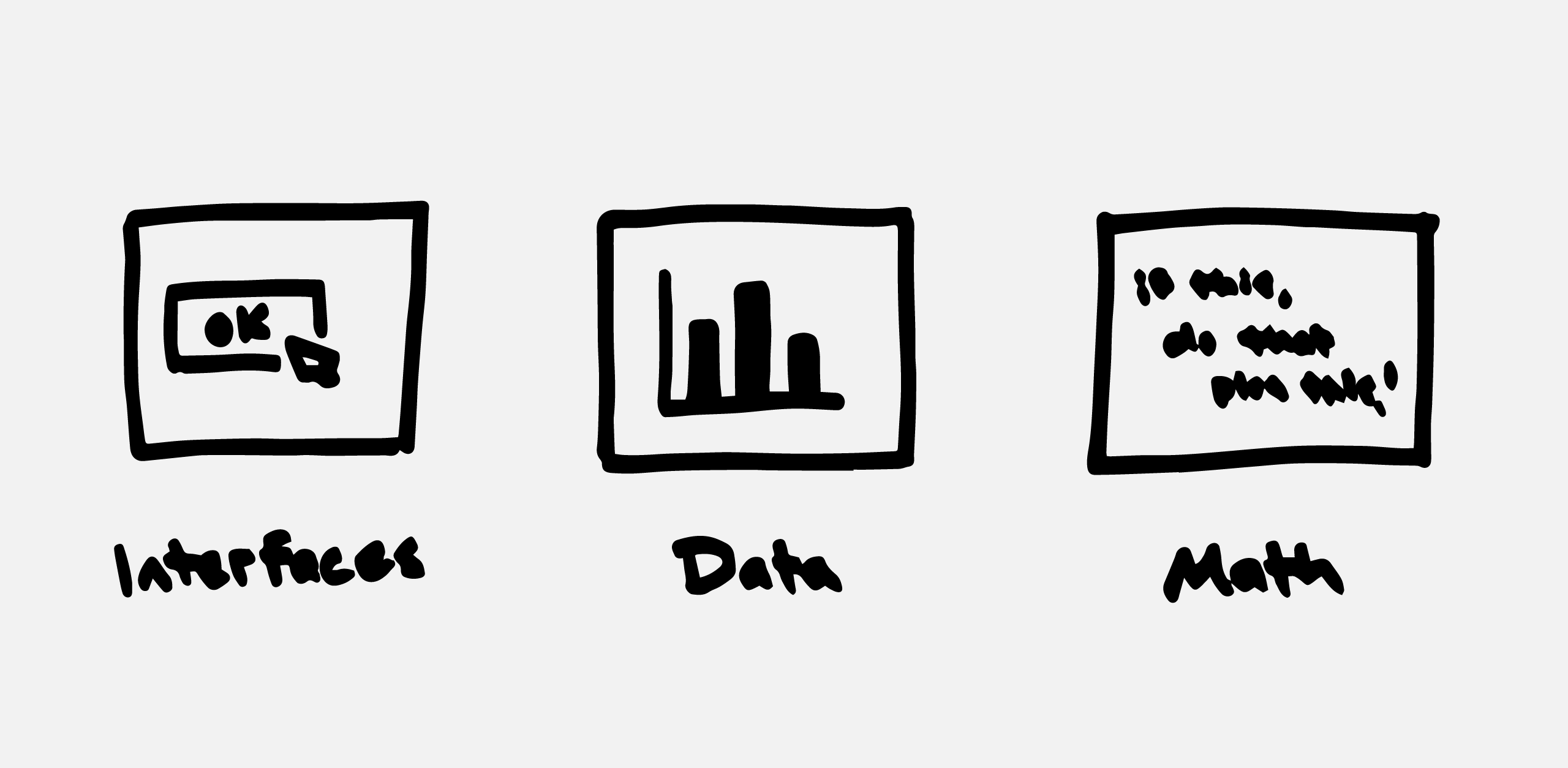
These three categories aren’t any kind of official terminology; people who teach computer science will probably tell me I’m missing some key details, and they’ll be right! (I’m also using words like computer software, applications, and programs pretty interchangeably.) But when my day job was computer programming, these categories helped me think and work more effectively. Now that my day job is public policy, maybe these categories will be useful to you as a public servant or political leader, as a way to understand technology decisions happening around you.
This is a long post; don’t feel any pressure to read it all at once! Here’s a quick shortcut to each section:
Interfaces
You’re reading this on a computer or smartphone, which means you’re already dealing with interfaces every day. An interface (in my own definition here) is a way that you as a person interact with computer software. It could be the buttons on your phone’s home screen, that you tap to open your web browser. It could be an online form, like on an e-commerce website, where you put in your shipping address and credit card number then click “Place order”. It could be the “Like” and “Share” buttons on social media websites, encouraging you to react to some kind of online content.
Interfaces have changed a lot over time, and continue to change. Back in earlier decades of computing, the interface for a computer was probably punchcards and wiring. Early desktop computers had green and black text prompts, as the only way to interact with the software on the computer. Desktop operating systems with mice and Start buttons were all steps in making interfaces that were easier for everyday people to use.
The last decade or two has seen interfaces – how they’re designed, and how easy they are for people to use – become the defining element on which many technology companies stake their reputation. Think of the iPod’s touch wheel, or the first touchscreen iPhone, or the Facebook news feed, or the list of recommended products at the bottom of any Amazon webpage. All of these interfaces became ways that companies distinguished themselves from their competitors, or kept their customers and users coming back again and again.
As a software developer, anytime I was working on a new feature, the interface was what I thought about first: What kinds of buttons or text fields would I need? What order would they be in? How would people get to this new feature from other, existing parts of our software product? If they had to, how would they get back again? Could they figure out those steps on their own? If they made a mistake, how easily could they undo it?
What does an interface look like?
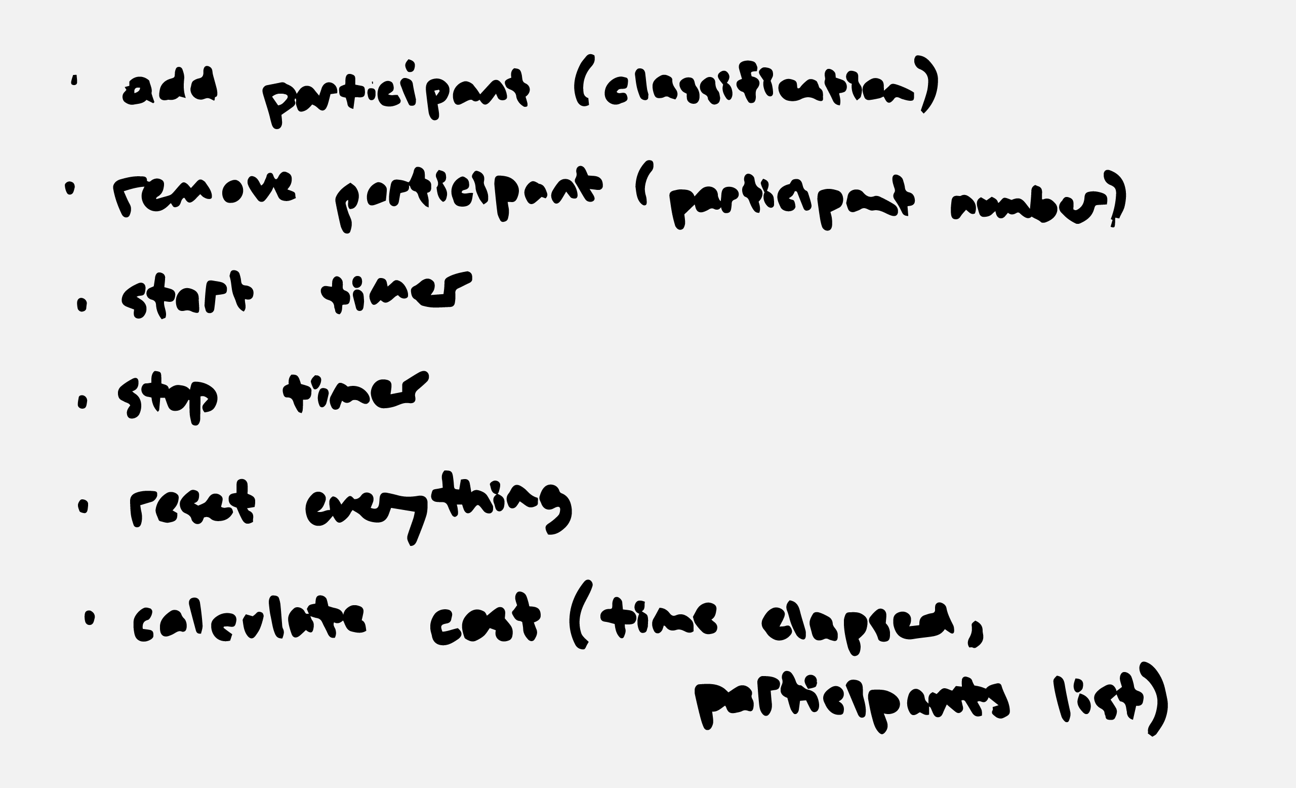
Here’s an example interface, from the first civic tech project I built – the Meeting Cost Calculator. Nothing is ever perfect on the first try, and I’m sure I drew five or six different sketches of the interface before starting to write it in code. You can see the buttons, the drop-down menu, the timer, and the cost display that make up the interface:
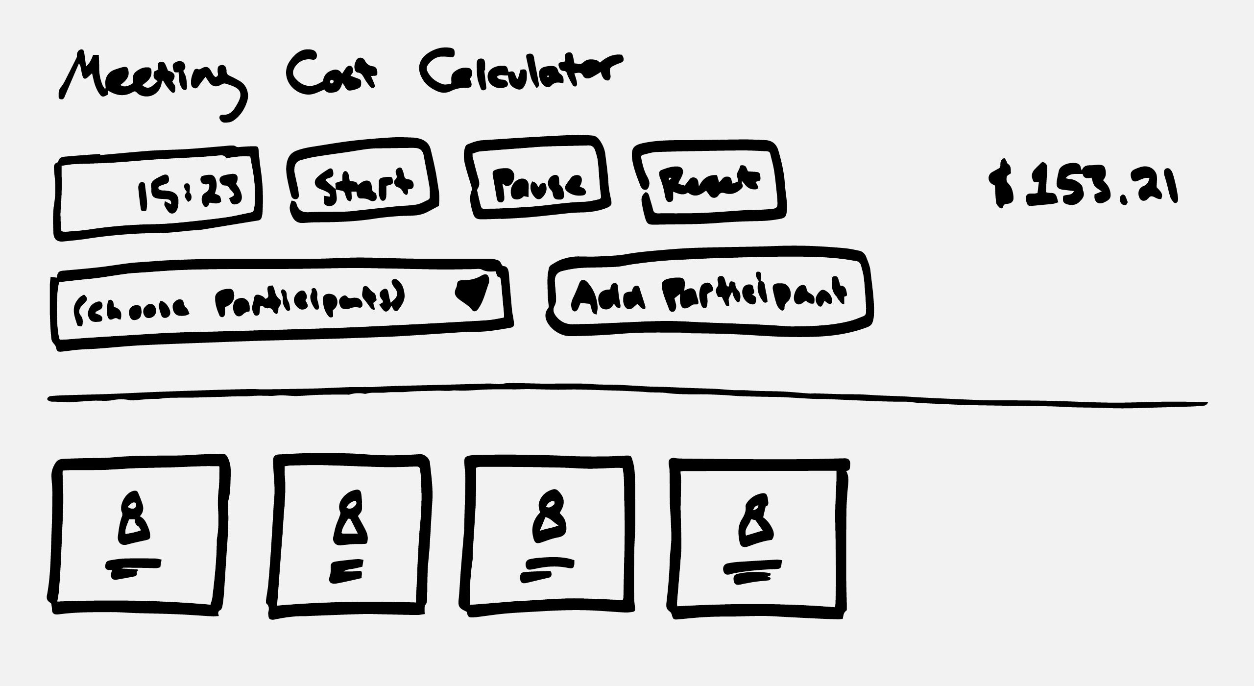
(In 2019, I very slightly redesigned the calculator interface again; you can see what it looks like nowadays here.)
Designing interfaces that are easy to understand and use is a whole field of its own – known sometimes as human-computer interaction or product design – and it involves art and psychology as much as it does programming skill. Done well – like the iPod click wheel – a good interface is quietly wonderful to use. Done poorly – like, well, most government software – bad interfaces slow people down, frustrate them, or stop them in their tracks.
Data
While I drew the interface for whatever I was about to program, I thought about the data I would need to make the new feature work. Buttons or text fields (or other online form pieces like radio buttons or checkboxes) are ways to ask people for data, so that your computer software can do what they want it to do. If people wanted to send a test survey to themselves, at my old job, for example, the software would need to know what mobile phone number to send it to. If they wanted to send it out at a particular time of day, the software would need to ask them what time.
Data is a shorthand word for “structured information”. Structured in the sense that the information is labelled and categorized in a way that computer software can understand it. This blog post – several hundred words of not-very-organized text – is unstructured information. A spreadsheet with really consistent columns and cells is structured information: without too much effort, a computer program can do something useful with the information in each cell. Databases are the exact same idea, but with even more pre-planned structure.
It can be hard to understand at first, but when you’re looking at a piece of software, almost anything that isn’t a consistent part of the interface is data. Imagine opening a spreadsheet in Excel: all the buttons and menus along the top are the interface; the information that you type into all the cells is data. Or, imagine a social media website like Twitter: the text box and the “Post Tweet” button at the top are the interface; all the tweets as you scroll down below are data, submitted in that case by other Twitter users. More accurately, each tweet has a bunch of kinds of data all associated together: the text of the tweet, what time it was posted, who posted it, the profile image for that person, the number of people that retweeted it, and so on.
Examples of data
When you’re designing a piece of computer software, you have to think carefully about what data you’ll need for it to work. In the Meeting Cost Calculator, going with the example above, publicly-available public servant salary data was what made it possible to build. Here’s a sketch of the data that went into building the calculator:
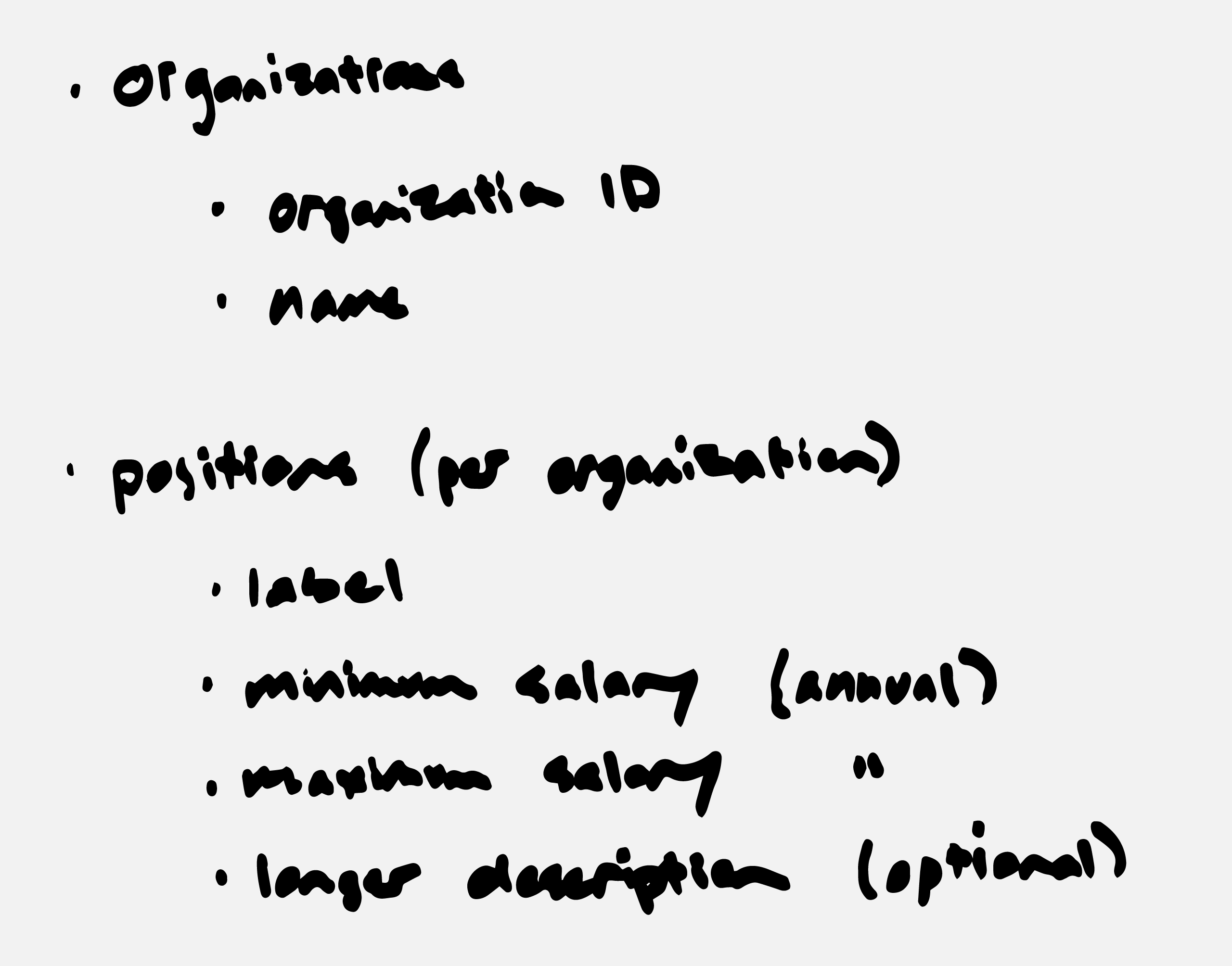
You can see what that data looks like in practice here, on GitHub. (The data is in a CSV format file, which is a bare-bones style of spreadsheet that can be read and understood by computer software more easily than, say, an Excel file.)
Good or bad data is often what makes the difference between software being useful or not. Some data is easy to come by automatically. When you’re posting a tweet, you don’t need to manually enter what time it was posted or what your username is; the Twitter website can easily tell what time “right now” is, and can tell what your username is because you’ve already had to log in. In other settings, data can be a real challenge. Think of scientists analyzing weather or ice melt in the Arctic – before their software can run a useful analysis, they might need several years of accumulated data from sensors physically installed in difficult conditions.
This is just scratching the surface; in the past decade, as social media use has accelerated, questions about how people’s personal data is used by social media platforms have become critical ethical and legal topics. Specialized professions (data scientists, for example) have emerged as companies and organizations try to make sense of larger and larger collections of data. These are all discussions for other posts, too. The point here is that data, no matter what kind, is almost always an essential ingredient for software systems to work properly.
Math
“Math” is not exactly the right word for this; the shorthand I’m going for here is “things that computers do on their own”. These things can be in response to some kind of interface activity – a person clicking the “Submit” button, for example. Or they can be automated in some way – a scheduled activity that a piece of software does at a certain time of day, or after some accumulated amount of data is reached.
When I worked as a software developer, this was the last step I did on paper before I started coding: listing all of the functions I would need to code to make my new feature work. “Functions” are small sections of computer code that do a specific task, usually with some kind of input as the ingredient that determines what the section of code does.
Math, or baking, or programming
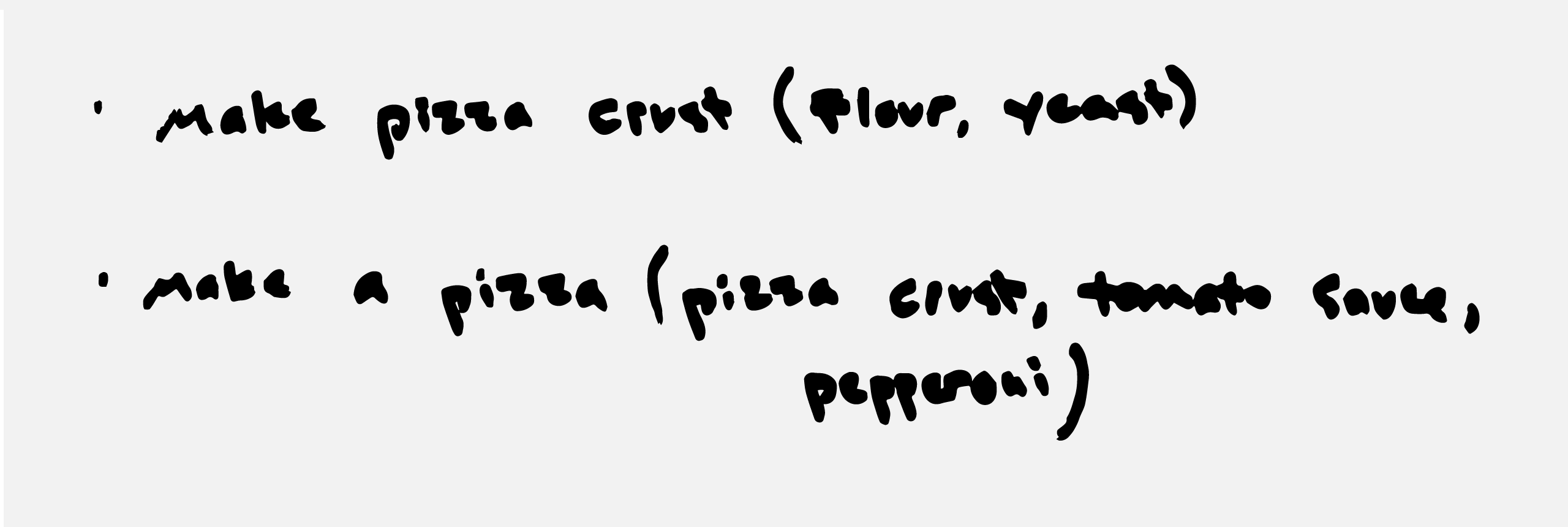
You can think of a function kind of like a baking or cooking recipe: this function takes in flour and yeast, and spits out a pizza crust. This next function takes in a pizza crust, some tomato sauce, and some pepperoni, and spits out a finished pizza. Each function has a predefined list of what inputs it will happily expect, and it consistently spits out the same results when given the same input ingredients. You can put in twice as much flour and yeast, and you might get a pizza crust twice as big. But if you only put in flour, without yeast, the function will probably complain and do nothing at all.
The theme here is that, under similar conditions and with the same input ingredients, software functions will do the same thing consistently. As a programmer, you write functions to do all the different things that you want your software to do. Generally speaking, a function is a verb – it does something. For example:
If the user clicks the “Submit” button below an online form, check if they’ve typed the right things in all the text fields (with a function named something like, “check form field data”).
If it turns out that everything looks good, save the data they’ve provided to the database (with a function named something like, “save data to database”).
Thinking back to my old job, we had pre-scheduled surveys to send out. We had a function that, once every minute, checks for pre-scheduled surveys that haven’t been sent out yet (“check for unsent surveys”). If the scheduled time for a given survey is in the future, don’t do anything yet. If the scheduled time is in the past, then send out the survey! (You guessed it: with a function named something like, “send out pre-scheduled survey”, and with the main ingredient being the unique ID number for that particular survey.)
Math that powers …a calculator 🧐
For the Meeting Cost Calculator, once I had the interface design sketched out and the data ready, the last step was writing the functions that make it all work. Most of these functions were related to the interface (what to do when someone clicks on a button, for example); the other main one was actually tallying up the cost of the meeting. Once per second, if the timer was running, the software would check how many “people” you had added to the meeting, what position and annual salary they were, then do some actual math to figure out the cost of the meeting “per second”. Then, it multiplied that by the amount of time that had gone by on the timer and displayed the total cost. Here’s what the calculator’s functions looked like:
That’s pretty much all that programming is. It’s not rocket science; it’s thinking of all the things you could possibly want your software to do, and writing small functions to do each of those things, one at a time.
I call this category “math” (instead of a more accurate term like “logic” or “functions” or, well, “programming”) because ultimately it’s not that different from high school math. Sine and cosine and other bits of trigonomic fun aren’t that different from the functions in any piece of software: you put some kind of ingredient or input in, and you get some kind of consistent output out. (If you didn’t enjoy trigonometry in high school – and who did! – then Excel spreadsheets are another good example: functions like SUM and AVERAGE are just like functions in more formal programming!) Sometimes you’re adding or subtracting or multiplying numbers; sometimes you’re using logical steps like “if this happens, do this; otherwise, do that.” The ideas behind it are all pretty much the same.
Complicated pieces of software just have lots and lots of functions, or functions that are each really big and are doing too many things at once. If you’re a good programmer, you’ll find ways to make things simpler instead of more complicated.
Abstractions make our world
Once you start thinking of software in terms of interfaces, data, and math, it can help you think differently about the software products you use everyday:
When you finish a Netflix show and it goes right into the next episode, that’s a clever bit of interface design meant to keep you watching.
When Facebook generates advertisements that seem creepily targeted at you, it’s because over several years of you liking and sharing posts, you were generating data that Facebook can use to guess your political and consumer preferences.
When you open Twitter and it shows a set of “Tweets you might like”, it’s because, in the time between when you last opened it, Twitter did some math (maybe something like, “find all the tweets that at least 20 people you follow retweeted but that you haven’t seen yet”).
These three categories aren’t a magic way to instantly become a software developer. But, as a software developer, they helped me make sense of what I was building. And no matter your field of work, they’re an interesting way to think about software, and to decide what you like or dislike about it, or what, in your view, works well or poorly about it.
You made it! Thanks for reading all this. If you’re looking to dive deeper into computer software, Paul Ford’s “What is code” is a fascinating (and, er, fascinatingly illustrated) long-read. Chris Allison’s “Guide to Digital” video series is also really excellent.
In government environments, technology often seems especially complicated and unknowable. Making computer software simpler and easier to understand – through abstractions like interfaces, data, and math – can help public servants make better technology decisions. In future posts, I’ll look at how these three categories can help you ask better questions, and how you can analyze a particular piece of government software based on each category. The more public servants we have that are equipped to ask good questions about technology, the better.