Public service tech tip: Please use headings
A guide to making your documents more awesome.
If you’re creating documents (which, as a public servant, you …probably do often), one of the most important things you can do is to use real headings. You’ll often see documents that are divided up by bolded or capitalized or underlined or slightly larger text, done by hand. That’s very 90’s. It’s very gauche. If you want to make great documents, please use headings.
Headings – real headings – are important because they tell people what the structure of your document is. Pretend headings (bolded or resized text) don’t include the information that tells your word processor where new sections of a document are. Using real headings means that people using screen readers or other accessibility tools can easily navigate and jump through your document. It also means that if your document is ever converted into a webpage or some other kind of format, it will already be properly structured and ready to go.
The other benefit of headings is that they let you format your document really consistently. You can make changes to the style of the headings you use, and instantly update them throughout your entire document. It’s a game-changer – once you start using them, you’ll never go back.
Adding headings in Word
These examples are for Word 2013 on Windows, for other versions see Microsoft’s documentation here.
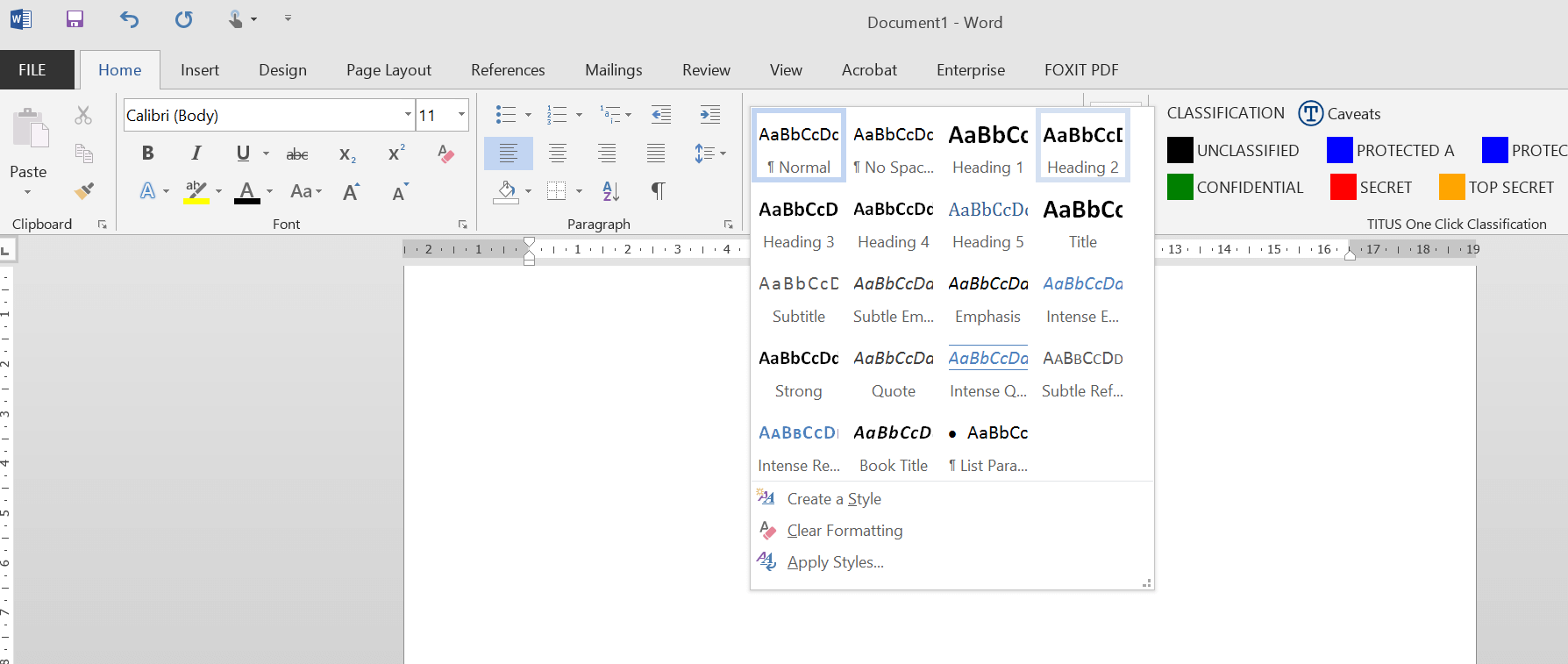
To add a heading in Word, place your text cursor on the line you’d like to make into a heading. Then, click on the small arrow in the “Styles” panel and choose the heading you’d like.
Once you get used to it, you can do this much faster by using keyboard shortcuts. To add a “Heading 2”, for example, hold down “Control” and “Alt” on your keyboard then push “2”. For a “Heading 3”, it’s “Control + Alt + 3” and so on.
To change a line of text back from a heading to a normal paragraph, the keyboard shortcut is “Control + Shift + N”.
Customizing how your headings look
Let’s be real, the default Microsoft Word headings aren’t great. They’re blue and weird and would look out of place in any government document. It makes you wonder if whoever made these styles the default may have accidentally set back Word accessibility by a decade.
Fortunately, you can change them! The most reliable way of doing this is:
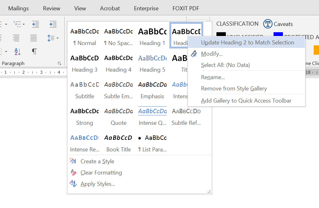
- Set your heading text to the desired heading number (e.g. “Heading 2”), and briefly hold your tongue while it’s blue and weird
- Change the font colour back to black, change the size (as needed), and make it bold, italic, etc. as you see fit
- In the styles panel, right-click on the same heading number (“Heading 2” in this case) and click “Update Heading 2 to Match Selection”
That’s all you need! Then, repeat the same steps for other heading numbers (Heading 1, Heading 3, etc.). You can customize these even more by right-clicking on the heading number again and clicking “Modify” (which brings up a screen with more options) but you’re good to go with just the steps above.
Using these steps (setting the text to the heading you want first, then modifying the font styles and so forth) helps make sure that you don’t accidentally lose any extra information about where the heading fits into the overall structure of the document (accidentally turning a Heading 3 into a Heading 2, for example).
What’s great is that you can use these same steps to change each heading style down the road, and Word will automatically update all the headings throughout your document.
Saving your heading styles in a Word template
Once you’ve got headings that you’re really happy with, you can save them to a Word template file. That way, you don’t need to create or customize them over and over again.
My approach to this is the following:
- Create a new, empty Word document
- Customize all the headings I use (typically from Heading 1 to Heading 4), by making sample lines of text for each heading
- Customize paragraph text (and update the style using the same steps as above), add page numbers to the footer at the bottom, and do any other page formatting changes
- Delete all the sample text from the document (except for the page numbers)
- Make the first line of the document a “Title” or “Heading 1” style, with no text in it
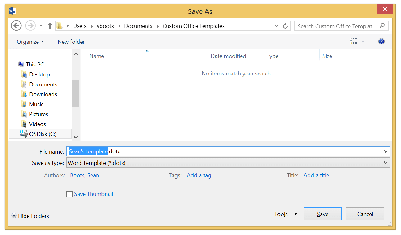
- Click “File > Save as…” and save the file as a “Word Template (.dotx)” file, in the default templates folder (on my computer, it’s “Documents / Custom Office Templates”). Give it a name you’ll recognize, like “Sean’s template” (replace that with your name, of course!) Don’t forget to change the type to “Word Template”:
To create a document using your new template, click “File > New” and you’ll see the template in the list on the right beside “Blank document”. Choose your new template and you’re good to go!
You can create custom templates for different kinds of projects you work on, and each one can have different styles.
What headings do I use?
When you’re new to headings, it’s hard to know which ones to use. The main thing is to be consistent, and to use headings in a way that shows the structure or hierarchy of the information in your document. Wright State University has a really helpful backgrounder on headings, and uses the following example:
- A Guide to the Babel Fish (Heading 1)
- What is a Babel Fish? (Heading 2)
- Physical Appearance (Heading 3)
- Decoding Mechanism (Heading 3)
- The Babel Fish in Philosophical Arguments (Heading 2)
- Oolon Colluphid’s Arguments (Heading 3)
- Argument for (Heading 4)
- Argument against (Heading 4)
- Agrajag’s Argument (Heading 3)
You can see how the headings are structured in a sensible, nested way. (You could think of a Christmas tree, or Babushka dolls, or a series of triangles – whatever metaphor works for you!) You wouldn’t have a Heading 2 “inside” of a Heading 3, for example.
Sometimes people tend to choose headings because of how they look – they want the particular font size or style associated with it. Don’t do that; think about the structure you want instead, use the headings that match that structure, and then change the font size or style of the headings to suit your needs using the steps above.
One of the big questions is whether your document should start with a “Title” or with a “Heading 1”. Here’s some quick rules of thumb:
- With webpages (or with documents that are meant to become webpages) it’s very straightforward: there should only be one single “Heading 1” on a webpage, so start with a Heading 1 and don’t use the “Title” style.
- With Word documents, if your document is short- or medium-length, start with a “Heading 1” as well and use “Heading 2s” and so on for each of your sections.
- If your Word document is a thesis, a long report, or a book with multiple chapters, you can start it with a “Title” and use “Heading 1s” for each chapter, for example.
In most everyday cases, though, I’d suggest starting with a “Heading 1” and not using the “Title” style. Remember, if you don’t like the font size or style that each of these use, you can easily customize them.
Overall, the important thing is to keep a consistent, nested structure, so if you use a Heading 1 to start off your document, don’t add other Heading 1s later in your document. Use Heading 2s to start each section, Heading 3s for any sub-sections, and so on.
If you’re writing a longer document and starting with a “Title”, then the same principle applies – there should only be one “Title” in your entire document, and each section or chapter would then start with a Heading 1.
Whichever one you use, the Heading 1 or Title that you start with becomes the top of the hierarchy (or top of the metaphorical Christmas tree), and everything else follows below it. It may sound complicated at first but you’ll get the hang of it fast.
Bonus: use paragraph spacing, not empty linebreaks
If you want to become a heading superstar – and do a huge favour to anyone turning your documents into webpages down the road – this last bonus tip is for you. It’s about normal paragraphs, as it turns out, not headings.
To create space between paragraphs, people normally just hit “Enter” twice to leave a blank space. The problem with that is that, if someone were to read your document with a screen reader, they’d keep being told about the blank lines – interrupting the flow from one paragraph to the next.
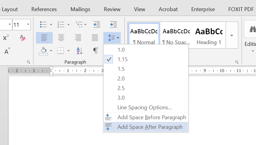
The way to fix this is to add “paragraph spacing” after each paragraph. You can do this from the “Line spacing” dropdown menu,
…or from the Paragraph options box that you access by right-clicking on your text and choosing “Paragraph”.
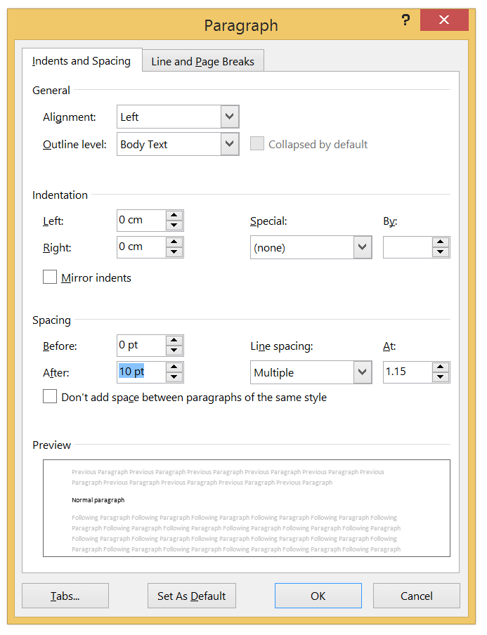
I typically use something like “10 pt” after each paragraph, and “0 pt” before each paragraph. Choose what looks like a normal space and you’ll be fine.
After you’ve done that, and while your text cursor is still in the same paragraph, go up to the Styles panel (from above), right-click on the “Normal” option, and click “Update Normal to match selection”. That will apply your new line spacing to every paragraph, including future ones that you type. Now, you don’t need to hit “Enter” twice between paragraphs. You’re good to go!
Sometimes this kind of line spacing can confuse people, when they really want to make two lines of text that are next to each other (for example, for a signoff or signature and job title at the bottom of a document). In those cases, you can use “Shift + Enter” on your keyboard (hold Shift and push Enter) to add a line break that doesn’t have the extra line spacing attached.
When you customize your heading styles (using the instructions above) and save a reusable template file, adding a Normal paragraph style with line spacing is a great addition. You can use the same line spacing options to customize the space around your headings. It’s a whole typographic art. The more you know!
Learn more
A number of universities have great websites that discuss accessibility best practices in Microsoft Word. This includes how to create good headings, along with other important steps (alternative image text, using tables and lists properly, and using Word’s built-in accessibility tools):
- Wright State University’s Accessibility for Online Course Content
- OCAD’s Accessible Digital Office Document (ADOD) Project
- University of Washington’s Accessible Technology website
- Penn State’s Accessibility website
Another great resource is the WebAim guide to creating accessible documents in Word.
If you use other tools (Google Docs, Pages for Mac, etc.), you can use similar steps to add real headings to your documents. Let me know if it’d be useful to add these as a future tech tip, and if you have any feedback, don’t hesitate to reach out!